UI / UX Design
View design file →
CoreCard
A modern financial management platform designed to simplify payments, rewards, subscriptions, and card controls in one seamless experience.
Year :
2026
Industry :
Fintech · Cards & Payments
Client :
CoreCard Fintech)
Project Duration :
1 Month
Role :
Product Designer
Team :
Solo designer × client product team
Tools :
Figma
Platform :
Web · Responsive
View more shots in the gallery →
Snapshot
Product: CoreCard, a financial management dashboard unifying cards, payments, rewards, flexible repayment and card controls.
Client: Confidential fintech client, engaged end-to-end, from information architecture to developer handoff.
My role: Lead product designer, research synthesis, IA, wireframes, high-fidelity UI, design system, marketing mockups.
Delivered: 45+ hi-fi screens across 5 modules, a complete style guide, and full light and dark themes.
Project Health
Overview
Card programs win or lose on the management experience. Issuing a card is table stakes; what keeps customers engaged is whether they can understand their money, act on it, and trust what they see. CoreCard was commissioned to be exactly that surface, a single dashboard where a customer’s cards, payments, rewards and repayment plans stop being four disconnected portals.
The product promise is stated on its own landing page: “Make Modern Payments A Reality.” For the business, the dashboard carries two jobs at once, reduce the support load created by routine card requests, and deepen engagement by making rewards and spending insight impossible to miss.

45+
Hi-fi screens designed
5
Core product modules
2
Full themes, light and dark
The Problem
Discovery with the client surfaced a consistent pattern: customers who hold multiple cards live across several portals. Statements arrive in different formats, credit limits are opaque, buy-now-pay-later plans are hard to track, and routine actions, raising a limit, changing a PIN, enabling travel, end up as support tickets because self-serve paths are buried or missing.
How might we give multi-card customers one legible home for spending, rewards and control, without burying the power features that heavy users depend on?


Constraints
Web-first and fully responsive: the same information architecture had to survive from a wide dashboard down to a phone screen.
Financial data density: statements, installments and limits demand precision without overwhelming a first-time user.
Light and dark themes were a launch requirement, not a retrofit, every color decision had to be made twice, at token level.
The client’s development team needed a component-level style guide to build against, not just screens.
Research & Insights
Research combined stakeholder discovery with the client team, a competitive teardown of card-management products, traditional bank portals on one end, neobank apps on the other, and a heuristic review of data-dense dashboard patterns. Three insights carried the most weight:
Most support demand comes from simple card actions. If limits, PINs, travel settings and delivery tracking are self-serve and discoverable, the dashboard directly reduces operational cost.
Customers think in questions: “how am I doing, what do I owe, what have I earned”, not in account structures. The home screen had to answer those questions before any navigation happens.
Trust in pay-later features depends on visible progress. An installment plan shown as a progress story gets used; one shown as a ledger gets feared.
Goals & Objectives
Make every routine card action self-serve and reachable within one click of the dashboard.
Answer the three money questions, balance, obligations, rewards, on the first screen, before any drill-down.
Turn buy-now-pay-later from a black box into visible, trackable repayment progress.
Codify a style guide that lets the client’s developers extend the product without design drift.
Process
The entire product was designed in grayscale first, onboarding, OTP authentication, dashboard, payments, rewards, Flex Pay and card controls were wireframed and agreed with the client before any color entered the file. That gate kept early reviews focused on structure instead of taste. High fidelity followed in light and dark simultaneously, and every decision was codified into a style guide covering the color system, the type scale, shadows, blurs, spacing and a full icon library, the artifact the development team built against.
Wireframes

Key Design Decisions
1. Grayscale before color
Every flow was approved as a wireframe before visual design began. The trade-off was a slower first impression for stakeholders, but it collapsed revision cycles later: structural feedback happened while structure was cheap to change, and the visual pass landed on an already-agreed skeleton.
2. A dashboard organized around questions, not features
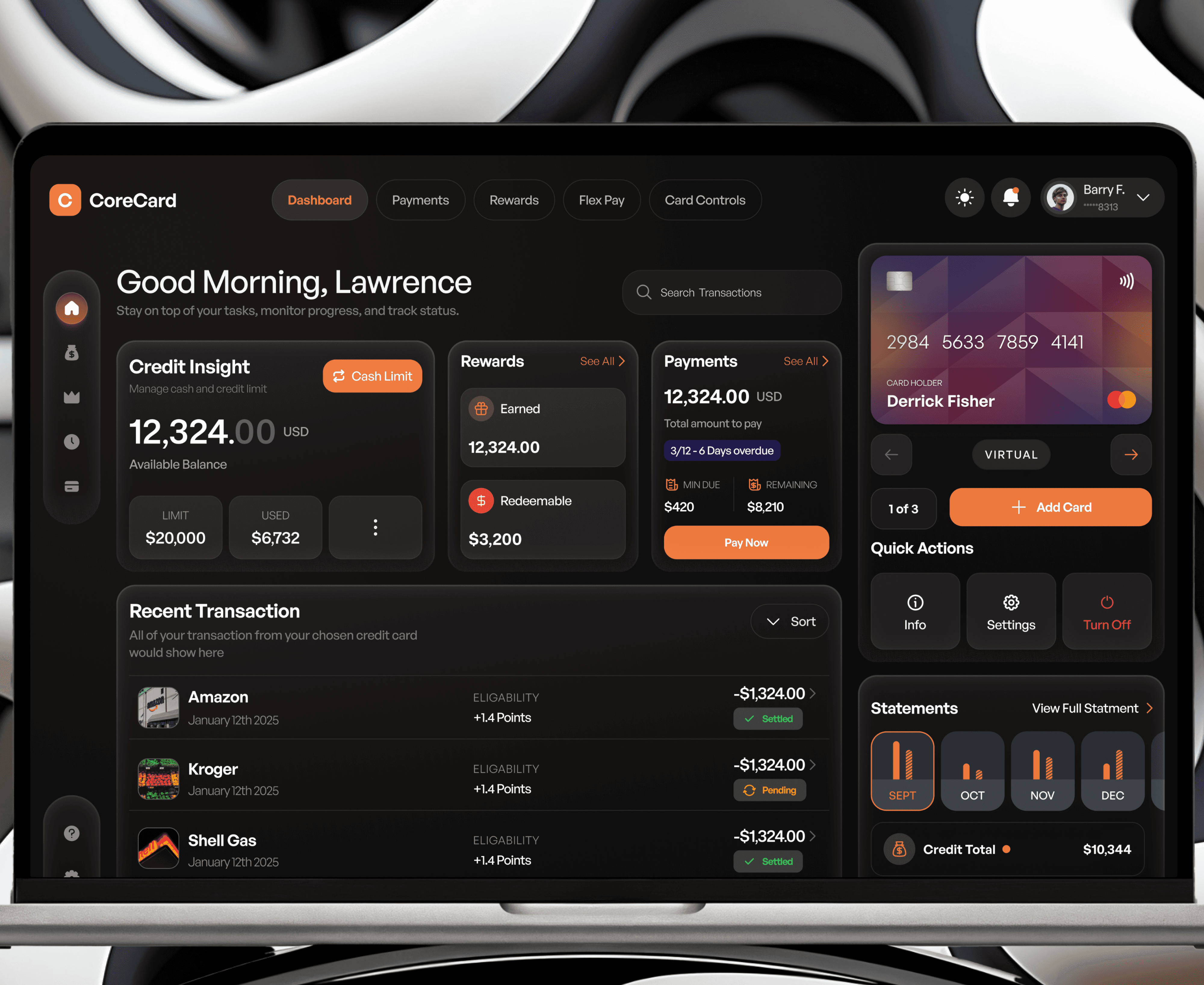
The obvious layout mirrors the product’s modules; the better one mirrors the customer’s mental model. The home screen leads with Credit Insight, Rewards and Payments, “how am I doing, what have I earned, what do I owe”, while feature access lives in persistent navigation. Features moved one level down so answers could move one level up.
3. Card controls as a first-class, self-serve module
Spending limits, PIN changes, travel settings and card delivery are full flows with confirmation states, not a settings afterthought. This is the decision most directly tied to business value: every completed self-serve action is a support ticket that never gets created. The accepted cost is a larger settings surface to design, test and maintain.
4. Pay-later as progress, not ledger
Flex Pay presents each plan as installment progress, what’s paid, what’s next, repayment history, rather than a transaction table. Customers extend more trust to obligations they can see shrinking; the design leans into that with progress states on every plan card.
5. Two themes, one token system
Light and dark were designed from a shared token layer rather than as a re-skin. Deciding colors at the system level doubled the up-front cost of the palette work, and paid it back the moment any component was built once and themed twice.
Style Guide
The Solution
Dashboard: personal greeting, credit insight, available balance, statements and quick actions in one glance.
Payments: transaction overview, top expenses and monthly statements built for scanning, not auditing.
Rewards: earned and redeemable points with top-merchant analytics that make engagement visible.
Flex Pay: buy-now-pay-later plans with installments, progress and repayment history.
Card Controls: saved cards, limits, PIN, travel settings and delivery tracking as self-serve flows.
High Fidelity

Results & Impact
The engagement delivered a developer-ready system rather than a set of screens: 45+ high-fidelity screens across five modules, in both themes, with a reusable style guide and marketing-ready device mockups, handed to the client’s development team as the product’s single visual source of truth.
Reflections
What worked: the grayscale gate. Structural sign-off before visual design was the single biggest saver of revision cycles.
What I’d do differently: specify motion earlier. Transitions between dashboard states were defined late, and some interaction nuance had to be settled during handoff.
What I’d validate next: a usability pass on card-control discoverability, and post-launch measurement of support-ticket deflection, the metric this design was built to move.
More Projects


CLIENT PROOF
Nick Simmons
founder of JAH creative design agency
Having Lawrence work under my agency made me money as an efficient designer he is, helped me retain my status as a Top 4% upwork agency and I can't be any less proud of him. Under me he learnt framer just so we could get more jobs and he delivered.
Loong Pancoast
CEO of DriveOn
Lawrence is a professional through and through. He has been an absolute pleasure to work with, taking in account all of our needs while meeting expectations. I would 100 percent recommend Lawrence for any developmental design needs. If you are hesitating, don't, you won't regret it.
Drew Levin
Co-founder of SideShift
Lawrence worked hand in hand with me and Nick Lawton to get the first version of our site out the door, staying flexible through every change we needed. His cooperation is a big reason we could launch on time and begin major operations. A designer who listens closely and delivers.
12:27

UI / UX Design
View design file →
CoreCard
A modern financial management platform designed to simplify payments, rewards, subscriptions, and card controls in one seamless experience.
Year :
2026
Industry :
Fintech · Cards & Payments
Client :
CoreCard Fintech)
Project Duration :
1 Month
Role :
Product Designer
Team :
Solo designer × client product team
Tools :
Figma
Platform :
Web · Responsive
View more shots in the gallery →
Snapshot
Product: CoreCard, a financial management dashboard unifying cards, payments, rewards, flexible repayment and card controls.
Client: Confidential fintech client, engaged end-to-end, from information architecture to developer handoff.
My role: Lead product designer, research synthesis, IA, wireframes, high-fidelity UI, design system, marketing mockups.
Delivered: 45+ hi-fi screens across 5 modules, a complete style guide, and full light and dark themes.
Project Health
Overview
Card programs win or lose on the management experience. Issuing a card is table stakes; what keeps customers engaged is whether they can understand their money, act on it, and trust what they see. CoreCard was commissioned to be exactly that surface, a single dashboard where a customer’s cards, payments, rewards and repayment plans stop being four disconnected portals.
The product promise is stated on its own landing page: “Make Modern Payments A Reality.” For the business, the dashboard carries two jobs at once, reduce the support load created by routine card requests, and deepen engagement by making rewards and spending insight impossible to miss.
45+
Hi-fi screens designed
5
Core product modules
2
Full themes, light and dark
The Problem
Discovery with the client surfaced a consistent pattern: customers who hold multiple cards live across several portals. Statements arrive in different formats, credit limits are opaque, buy-now-pay-later plans are hard to track, and routine actions, raising a limit, changing a PIN, enabling travel, end up as support tickets because self-serve paths are buried or missing.
How might we give multi-card customers one legible home for spending, rewards and control, without burying the power features that heavy users depend on?
Constraints
Web-first and fully responsive: the same information architecture had to survive from a wide dashboard down to a phone screen.
Financial data density: statements, installments and limits demand precision without overwhelming a first-time user.
Light and dark themes were a launch requirement, not a retrofit, every color decision had to be made twice, at token level.
The client’s development team needed a component-level style guide to build against, not just screens.
Research & Insights
Research combined stakeholder discovery with the client team, a competitive teardown of card-management products, traditional bank portals on one end, neobank apps on the other, and a heuristic review of data-dense dashboard patterns. Three insights carried the most weight:
Most support demand comes from simple card actions. If limits, PINs, travel settings and delivery tracking are self-serve and discoverable, the dashboard directly reduces operational cost.
Customers think in questions: “how am I doing, what do I owe, what have I earned”, not in account structures. The home screen had to answer those questions before any navigation happens.
Trust in pay-later features depends on visible progress. An installment plan shown as a progress story gets used; one shown as a ledger gets feared.
Goals & Objectives
Make every routine card action self-serve and reachable within one click of the dashboard.
Answer the three money questions, balance, obligations, rewards, on the first screen, before any drill-down.
Turn buy-now-pay-later from a black box into visible, trackable repayment progress.
Codify a style guide that lets the client’s developers extend the product without design drift.
Process
The entire product was designed in grayscale first, onboarding, OTP authentication, dashboard, payments, rewards, Flex Pay and card controls were wireframed and agreed with the client before any color entered the file. That gate kept early reviews focused on structure instead of taste. High fidelity followed in light and dark simultaneously, and every decision was codified into a style guide covering the color system, the type scale, shadows, blurs, spacing and a full icon library, the artifact the development team built against.
Wireframes
Key Design Decisions
1. Grayscale before color
Every flow was approved as a wireframe before visual design began. The trade-off was a slower first impression for stakeholders, but it collapsed revision cycles later: structural feedback happened while structure was cheap to change, and the visual pass landed on an already-agreed skeleton.
2. A dashboard organized around questions, not features
The obvious layout mirrors the product’s modules; the better one mirrors the customer’s mental model. The home screen leads with Credit Insight, Rewards and Payments, “how am I doing, what have I earned, what do I owe”, while feature access lives in persistent navigation. Features moved one level down so answers could move one level up.
3. Card controls as a first-class, self-serve module
Spending limits, PIN changes, travel settings and card delivery are full flows with confirmation states, not a settings afterthought. This is the decision most directly tied to business value: every completed self-serve action is a support ticket that never gets created. The accepted cost is a larger settings surface to design, test and maintain.
4. Pay-later as progress, not ledger
Flex Pay presents each plan as installment progress, what’s paid, what’s next, repayment history, rather than a transaction table. Customers extend more trust to obligations they can see shrinking; the design leans into that with progress states on every plan card.
5. Two themes, one token system
Light and dark were designed from a shared token layer rather than as a re-skin. Deciding colors at the system level doubled the up-front cost of the palette work, and paid it back the moment any component was built once and themed twice.
Style Guide
The Solution
Dashboard: personal greeting, credit insight, available balance, statements and quick actions in one glance.
Payments: transaction overview, top expenses and monthly statements built for scanning, not auditing.
Rewards: earned and redeemable points with top-merchant analytics that make engagement visible.
Flex Pay: buy-now-pay-later plans with installments, progress and repayment history.
Card Controls: saved cards, limits, PIN, travel settings and delivery tracking as self-serve flows.
High Fidelity
Results & Impact
The engagement delivered a developer-ready system rather than a set of screens: 45+ high-fidelity screens across five modules, in both themes, with a reusable style guide and marketing-ready device mockups, handed to the client’s development team as the product’s single visual source of truth.
Reflections
What worked: the grayscale gate. Structural sign-off before visual design was the single biggest saver of revision cycles.
What I’d do differently: specify motion earlier. Transitions between dashboard states were defined late, and some interaction nuance had to be settled during handoff.
What I’d validate next: a usability pass on card-control discoverability, and post-launch measurement of support-ticket deflection, the metric this design was built to move.
More Projects
CLIENT PROOF
Nick Simmons
founder of JAH creative design agency
Having Lawrence work under my agency made me money as an efficient designer he is, helped me retain my status as a Top 4% upwork agency and I can't be any less proud of him. Under me he learnt framer just so we could get more jobs and he delivered.
Loong Pancoast
CEO of DriveOn
Lawrence is a professional through and through. He has been an absolute pleasure to work with, taking in account all of our needs while meeting expectations. I would 100 percent recommend Lawrence for any developmental design needs. If you are hesitating, don't, you won't regret it.
Drew Levin
Co-founder of SideShift
Lawrence worked hand in hand with me and Nick Lawton to get the first version of our site out the door, staying flexible through every change we needed. His cooperation is a big reason we could launch on time and begin major operations. A designer who listens closely and delivers.
12:27
UI / UX Design
View design file →
CoreCard
A modern financial management platform designed to simplify payments, rewards, subscriptions, and card controls in one seamless experience.
Year :
2026
Industry :
Fintech · Cards & Payments
Client :
CoreCard Fintech)
Project Duration :
1 Month
Role :
Product Designer
Team :
Solo designer × client product team
Tools :
Figma
Platform :
Web · Responsive
View more shots in the gallery →
Snapshot
Product: CoreCard, a financial management dashboard unifying cards, payments, rewards, flexible repayment and card controls.
Client: Confidential fintech client, engaged end-to-end, from information architecture to developer handoff.
My role: Lead product designer, research synthesis, IA, wireframes, high-fidelity UI, design system, marketing mockups.
Delivered: 45+ hi-fi screens across 5 modules, a complete style guide, and full light and dark themes.
Project Health
Overview
Card programs win or lose on the management experience. Issuing a card is table stakes; what keeps customers engaged is whether they can understand their money, act on it, and trust what they see. CoreCard was commissioned to be exactly that surface, a single dashboard where a customer’s cards, payments, rewards and repayment plans stop being four disconnected portals.
The product promise is stated on its own landing page: “Make Modern Payments A Reality.” For the business, the dashboard carries two jobs at once, reduce the support load created by routine card requests, and deepen engagement by making rewards and spending insight impossible to miss.
45+
Hi-fi screens designed
5
Core product modules
2
Full themes, light and dark
The Problem
Discovery with the client surfaced a consistent pattern: customers who hold multiple cards live across several portals. Statements arrive in different formats, credit limits are opaque, buy-now-pay-later plans are hard to track, and routine actions, raising a limit, changing a PIN, enabling travel, end up as support tickets because self-serve paths are buried or missing.
How might we give multi-card customers one legible home for spending, rewards and control, without burying the power features that heavy users depend on?
Constraints
Web-first and fully responsive: the same information architecture had to survive from a wide dashboard down to a phone screen.
Financial data density: statements, installments and limits demand precision without overwhelming a first-time user.
Light and dark themes were a launch requirement, not a retrofit, every color decision had to be made twice, at token level.
The client’s development team needed a component-level style guide to build against, not just screens.
Research & Insights
Research combined stakeholder discovery with the client team, a competitive teardown of card-management products, traditional bank portals on one end, neobank apps on the other, and a heuristic review of data-dense dashboard patterns. Three insights carried the most weight:
Most support demand comes from simple card actions. If limits, PINs, travel settings and delivery tracking are self-serve and discoverable, the dashboard directly reduces operational cost.
Customers think in questions: “how am I doing, what do I owe, what have I earned”, not in account structures. The home screen had to answer those questions before any navigation happens.
Trust in pay-later features depends on visible progress. An installment plan shown as a progress story gets used; one shown as a ledger gets feared.
Goals & Objectives
Make every routine card action self-serve and reachable within one click of the dashboard.
Answer the three money questions, balance, obligations, rewards, on the first screen, before any drill-down.
Turn buy-now-pay-later from a black box into visible, trackable repayment progress.
Codify a style guide that lets the client’s developers extend the product without design drift.
Process
The entire product was designed in grayscale first, onboarding, OTP authentication, dashboard, payments, rewards, Flex Pay and card controls were wireframed and agreed with the client before any color entered the file. That gate kept early reviews focused on structure instead of taste. High fidelity followed in light and dark simultaneously, and every decision was codified into a style guide covering the color system, the type scale, shadows, blurs, spacing and a full icon library, the artifact the development team built against.
Wireframes
Key Design Decisions
1. Grayscale before color
Every flow was approved as a wireframe before visual design began. The trade-off was a slower first impression for stakeholders, but it collapsed revision cycles later: structural feedback happened while structure was cheap to change, and the visual pass landed on an already-agreed skeleton.
2. A dashboard organized around questions, not features
The obvious layout mirrors the product’s modules; the better one mirrors the customer’s mental model. The home screen leads with Credit Insight, Rewards and Payments, “how am I doing, what have I earned, what do I owe”, while feature access lives in persistent navigation. Features moved one level down so answers could move one level up.
3. Card controls as a first-class, self-serve module
Spending limits, PIN changes, travel settings and card delivery are full flows with confirmation states, not a settings afterthought. This is the decision most directly tied to business value: every completed self-serve action is a support ticket that never gets created. The accepted cost is a larger settings surface to design, test and maintain.
4. Pay-later as progress, not ledger
Flex Pay presents each plan as installment progress, what’s paid, what’s next, repayment history, rather than a transaction table. Customers extend more trust to obligations they can see shrinking; the design leans into that with progress states on every plan card.
5. Two themes, one token system
Light and dark were designed from a shared token layer rather than as a re-skin. Deciding colors at the system level doubled the up-front cost of the palette work, and paid it back the moment any component was built once and themed twice.
Style Guide
The Solution
Dashboard: personal greeting, credit insight, available balance, statements and quick actions in one glance.
Payments: transaction overview, top expenses and monthly statements built for scanning, not auditing.
Rewards: earned and redeemable points with top-merchant analytics that make engagement visible.
Flex Pay: buy-now-pay-later plans with installments, progress and repayment history.
Card Controls: saved cards, limits, PIN, travel settings and delivery tracking as self-serve flows.
High Fidelity
Results & Impact
The engagement delivered a developer-ready system rather than a set of screens: 45+ high-fidelity screens across five modules, in both themes, with a reusable style guide and marketing-ready device mockups, handed to the client’s development team as the product’s single visual source of truth.
Reflections
What worked: the grayscale gate. Structural sign-off before visual design was the single biggest saver of revision cycles.
What I’d do differently: specify motion earlier. Transitions between dashboard states were defined late, and some interaction nuance had to be settled during handoff.
What I’d validate next: a usability pass on card-control discoverability, and post-launch measurement of support-ticket deflection, the metric this design was built to move.
More Projects
CLIENT PROOF
Nick Simmons
founder of JAH creative design agency
Having Lawrence work under my agency made me money as an efficient designer he is, helped me retain my status as a Top 4% upwork agency and I can't be any less proud of him. Under me he learnt framer just so we could get more jobs and he delivered.
Loong Pancoast
CEO of DriveOn
Lawrence is a professional through and through. He has been an absolute pleasure to work with, taking in account all of our needs while meeting expectations. I would 100 percent recommend Lawrence for any developmental design needs. If you are hesitating, don't, you won't regret it.
Drew Levin
Co-founder of SideShift
Lawrence worked hand in hand with me and Nick Lawton to get the first version of our site out the door, staying flexible through every change we needed. His cooperation is a big reason we could launch on time and begin major operations. A designer who listens closely and delivers.
12:27